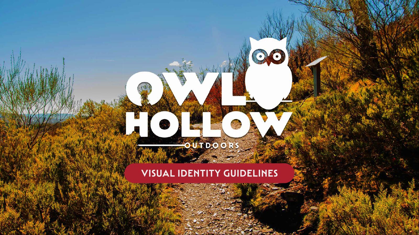
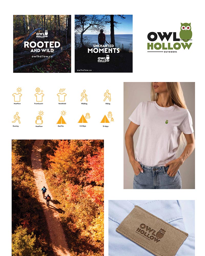
Branding

Outdoor Brand Book

A complete outdoor brand identity system covering logo usage, visual language, colour strategy, and supporting brand assets.

Overview

Owl Hollow Outdoors – Brand Book

The Goal

Owl Hollow Outdoors is a lifestyle brand created for individuals who feel connected to nature and outdoor experiences. This project focused on developing a complete visual identity system, including logo design, color palette, typography, and brand applications. The goal was to build a brand that reflects calmness, exploration, and authenticity, while maintaining a modern and clean aesthetic across all touchpoints.

Product Demo Video

Brand Concept

The brand is inspired by the idea of finding comfort in nature — quiet forests, open skies, and changing seasons.

It represents people who:

  • Enjoy outdoor experiences as part of their lifestyle
  • Value simplicity, durability, and thoughtful design
  • Prefer meaningful experiences over fast trends

As defined in the brand story, Owl Hollow Outdoors is designed for those who see the outdoors not just as a destination, but as a way of life

Product Demo Video

Design System

Design Approach

Visual Style

  • Real-life outdoor photography (forest, lake, horizon)
  • Natural lighting and cinematic framing
  • Human subject to create relatability

Typography

  • Bold, uppercase typography for strong impact
  • Clear hierarchy

Layout Composition

  • Center-aligned messaging for balance
  • Foreground subject + background depth
  • Logo placed strategically for brand recall

Color Strategy

  • Cool blues and natural tones reflecting
  • Calmness
  • Outdoor atmosphere

Brand Alignment

This design follows the Owl Hollow brand guidelines:

  • Consistent logo placement
  • Clean and minimal layout
  • Nature-focused imagery
  • Strong emotional tone

Brand Applications

The visual identity was applied across different real-world scenarios, including:

  • Apparel tags and patches
  • Packaging elements
  • Tote bags and merchandise
  • T-shirt mockups

Final Outcome

The final result is a cohesive brand system that:

  • Clearly communicates the brand identity
  • Maintains consistency across all platforms
  • Balances aesthetics with functionality

The project successfully translates a lifestyle concept into a strong, scalable visual identity suitable for real-world applications.

Back to Projects View Brand Book

Reflection

This project helped me understand how a strong brand is built beyond just visuals. I explored how elements like logo, color, and typography work together to create a consistent and meaningful identity.

One of the key challenges was maintaining balance between minimal design and strong storytelling. I focused on keeping the visuals clean while still communicating the brand’s connection to nature and outdoor experiences.

Through this process, I learned the importance of:

  • Designing with a clear concept and purpose
  • Maintaining consistency across all brand elements
  • Creating a flexible system that works across different applications